HOMIES
Homies Redesign: A User-Focused Refresh for Onboarding, Matching, Task Management, and Gamification on the dashboard of daily tasks for neurodivergent users
.png)
My role
-
UX researcher
-
UX Designer
Tools
-
Figjam
-
Figma
-
Miro
-
Whimsical
-
UX pilot
Timeline
-
3 months
Deliverables
-
Competitive analysis
-
Sketches
-
Wireframes
-
Mockups
-
Prototypes
-
Design system
Goal
The project aimed to redesign the Homies website to improve task management, enhance personalization, and increase accessibility for more efficient user interaction.
Client
Homies is California’s first life-sharing platform that helps adults with disabilities live more independently by matching them with compatible, supportive roommates based on shared routines, interests, and preferences. The organization focuses on empowerment, choice, and long-term connection, offering ongoing support, training, and personalized living plans to ensure safe, fulfilling, and enriching shared-living experiences.
Problem
This project focused on addressing the challenges neurodivergent users faced with Homies’ overwhelming dashboard layout and unclear task management flows, which made it difficult to stay organized and independent. It also aimed to improve the matching experience and overall engagement to better support users in the life-sharing program.
Challenges
Provide a general description of the items below and introduce the services you offer. Click on the text box to edit the content.

LACK OF ORGANIZATION and VISUAL HIERARCHY
The dashboard suffered from weak visual hierarchy and poor organization, making it difficult for neurodivergent users to understand what to focus on. Important tasks blended into the background, and the layout did not guide users toward their priorities, leading to frustration and reduced confidence in managing daily routines.

UNCLEAR AND INCONSISTENT TASK FLOWS
Users struggled to complete tasks due to inconsistent steps, unclear labels, and confusing navigation within the task and chore management features. This lack of clarity increased cognitive load, often causing users to miss important actions or feel unsure about whether tasks were completed correctly.

LIMITED AND OPAQUE MATCHING EXPERIENCE
The matching process did not clearly communicate how compatibility was determined or what users could expect from their supportive roommates. This opacity created uncertainty, reduced trust in the system, and made it harder for users to feel confident and supported in their shared-living arrangements.
Discovery
Understand the current state of website ,pain points and challenges
Steps taken for User Research
User Interviews
Conducted five interviews with Homies and supporting roommates who were able to address current pain points to understand the issues with the current dashboard how it could be improved.
This helped us understand the 10 issues on the current dashboard and problems in matching with supporting roommates and user pain points
Competitive analysis
Compared 7 apps to do feature comparison analysis of similar areas to improve - usability, task management, and improving the matching experience to understand how different apps address the three similar issues of user engagement, matching, and inclusivity task management
Apps analyzed: Habitica and Duolingo to study gamification streaks and rewards, Headspace,Roomsync,Bumblebee,Noplace to improve the matching process, and Airbnb for user engagement.
The competitive analysis helped us understand the strengths and gaps for Homies and how we can use inspiration from other apps to improve Homies
.png)
Design Audit OF Homies website
Design audit was performed as part of UX analysisfor Homies a comprehensive examination of a brand's digital interfaces to improve the user experience.
The audit evaluates the visual design, content, and usability of a product to ensure it meets user expectations and industry standards..
Key Themes from Design Audit
Accessibility - using simpler words, more images, colors, stimulation, proactive help
Visual Hierarchy
Tasks not personalized enough
Use of AI - could be used for recommending profiles
Define
Identify the problem space to clearly articulate the core challenge that needs solving. This step builds on the insights gathered during the Discovery phase and transforms them into a meaningful problem statement.
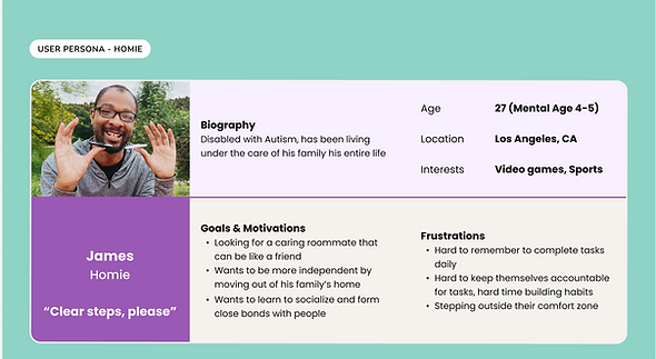
Persona Homies
2 personas were created to understand the pain points, motivation for homies, and supporting roommates.Helped us to focus on real needs rather than vague assumptions.
Persona Supporting Roomamte
2 personas were created to understand the pain points, motivation for homies, and supporting roommates.Helped us to focus on real needs rather than vague assumptions.

Affinity Mapping
Organized 50 insights from discovery activities using findings by intergrating UX audit of Homies and user interviews and into 12 themes. Helped to identify patterns, five pain points, and five opportunities to improve the dashboard and design

User Flows
The user flows for the Homies redesign were created by mapping the key journeys that neurodivergent users and their supporting roommates take within the app.
We mapped the primary use cases for the scenarios
A new Homie signing up and being paired with a supporting roommate.
Managing daily tasks and receiving reminders on the dashboard.
Tracking progress and viewing rewards through gamified features.
This made it easier to identify friction points and optimize the experience before moving into the design phase. They also provided a clear blueprint that aligned the team on how interactions should function, ensuring smoother collaboration and consistency across the redesign.
Onboarding and matching

Task management

Ideate and Design
During the Ideate & Design phase, we translated research insights into structured, user-centered solutions through iterative exploration, refinement, and the creation of a cohesive visual system.”
Generate ideas
Crazy 8 sketches
We used Crazy Eight sketches to generate a wide range of ideas quickly and avoid getting stuck on a single solution too early.
The fast-paced format pushed us to think creatively about improving onboarding, task management, and matching, while also uncovering unexpected directions

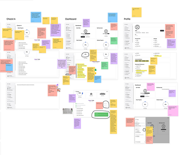
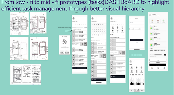
Low-Fi wireframes
Wireframes of the four key features helped us turn research insights into tangible design solutions by mapping out the structure and flow
They helped visualize the layout and structure of key features, such as the dashboard, task management, and matching flows, ensuring the information was straightforward and easy to follow for neurodivergent users.
Through early testing, the wireframes allowed the team to identify usability issues before investing in high-fidelity design

Mid-Fi wireframes
Used the low-fi wireframe and added more features like Ui elements,icons and interactions to create mid-fi wireframes and refined functionality and hierarchy based on the feedback from low-fi wireframes
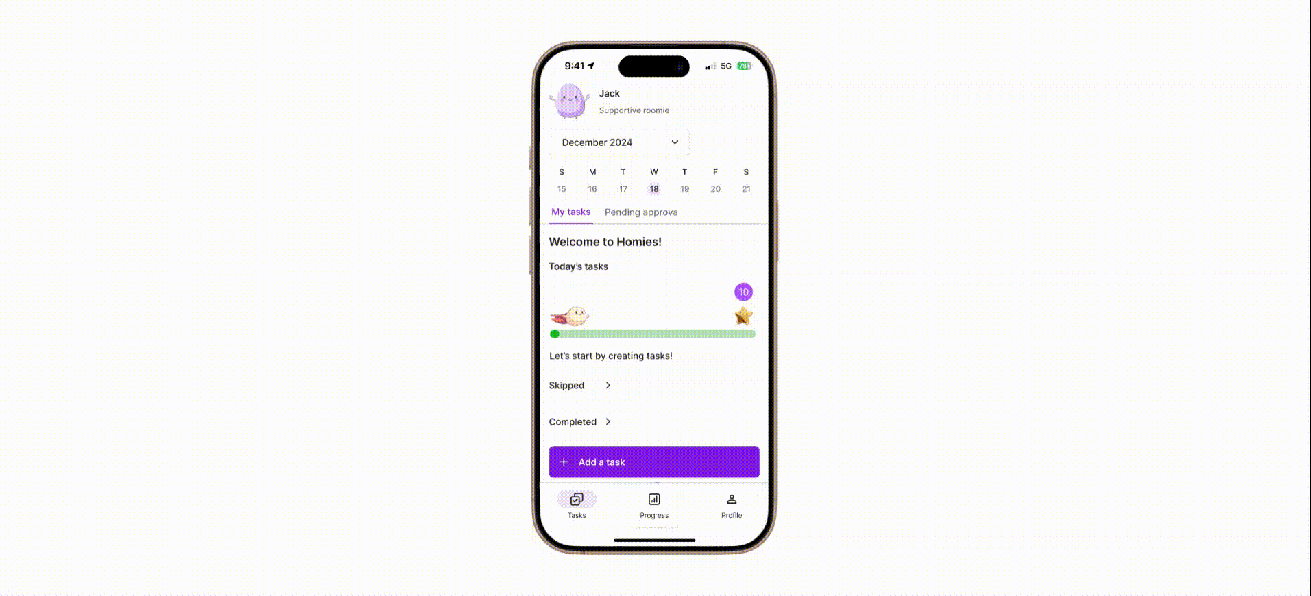
Hi-Fi Mockups
Mockups helped give the team and stakeholders a polished view of how the redesigned screens would look,
Also allowed us to refine visual details—layout, colors, and typography — for accessibility and consistency.

Design System
It standardized visual and interactive elements such as colors, typography, and components, improving accessibility and making the app more inclusive for neurodivergent users.
Gamification icons, color branding task icons, and progress bar were some of the important elements
added as part of the design system
The design system was created to ensure consistency and efficiency across the Homies redesign.
Interactive prototype
Prototypes enabled interactive usability testing to validate flows and provide a shared reference for stakeholders and developers to understand functionality.

Outcomes
The redesigned dashboard and task management system provided clearer organization, visual progress tracking, and simplified chore management, making it easier for neurodivergent users to stay on top of daily tasks.
Matching experience improvements offered a smoother onboarding and better pairing with supportive roommates, fostering independence and collaboration.
Accessibility-focused updates—such as more precise navigation, improved contrast, and reduced cognitive load—helped create a more inclusive, user-friendly experience.
Gamification elements like streaks and rewards increased motivation and engagement, making the app more enjoyable and sustainable to use.

Next Steps
After the design phase, we handed the deliverables to the client for implementation .
Future Consideration
For future consideration, we should continue to expand accessibility features with direct input from neurodivergent users to ensure the app evolves in line with their real needs and limitations.
It will also be essential to explore in-depth AI personalization and gamification strategies to keep users engaged in the long term while maintaining simplicity and clarity in the experience.
Lessons Learned
A powerful lesson learned was that designing for neurodivergent users requires going beyond surface-level accessibility—truly understanding their daily challenges, sensory sensitivities, and cognitive load is critical to building supportive tools.
I also recognized that limitations, such as overwhelming dashboards or unclear task flows, can quickly erode independence. Therefore, creating simple, structured, and customizable experiences is not just good design, but essential for empowering users to thrive.